5 Markdowns tricks you can apply in Squarespace
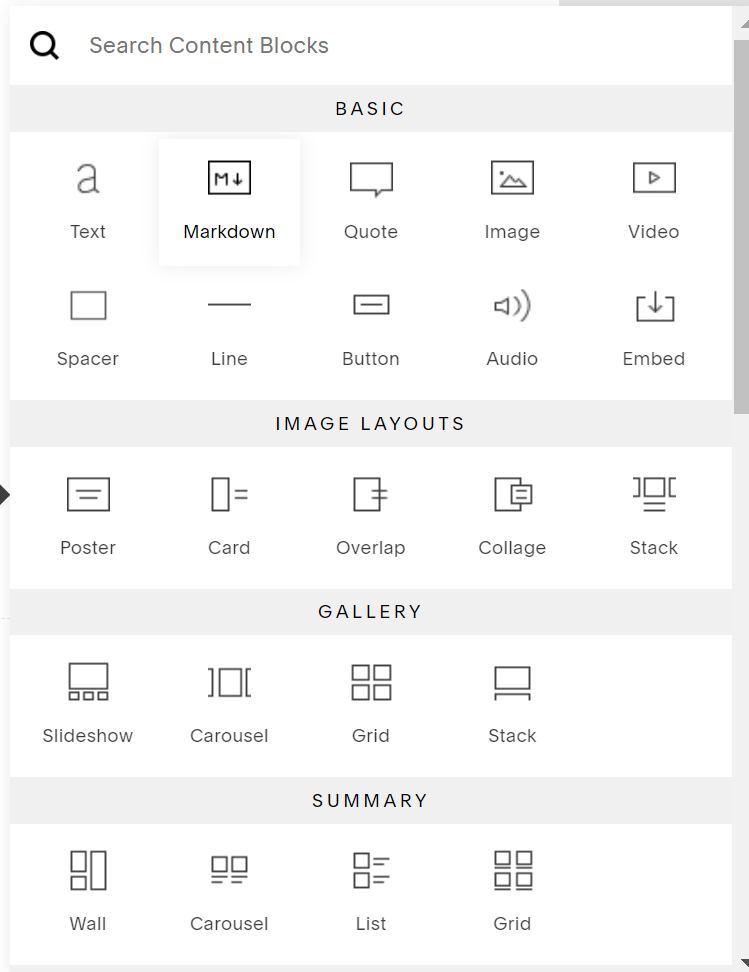
You’ve probably seen the Markdown block in Squarespace and thought that’s neat but not sure what all I can do with it.
But there is a lot you can do!
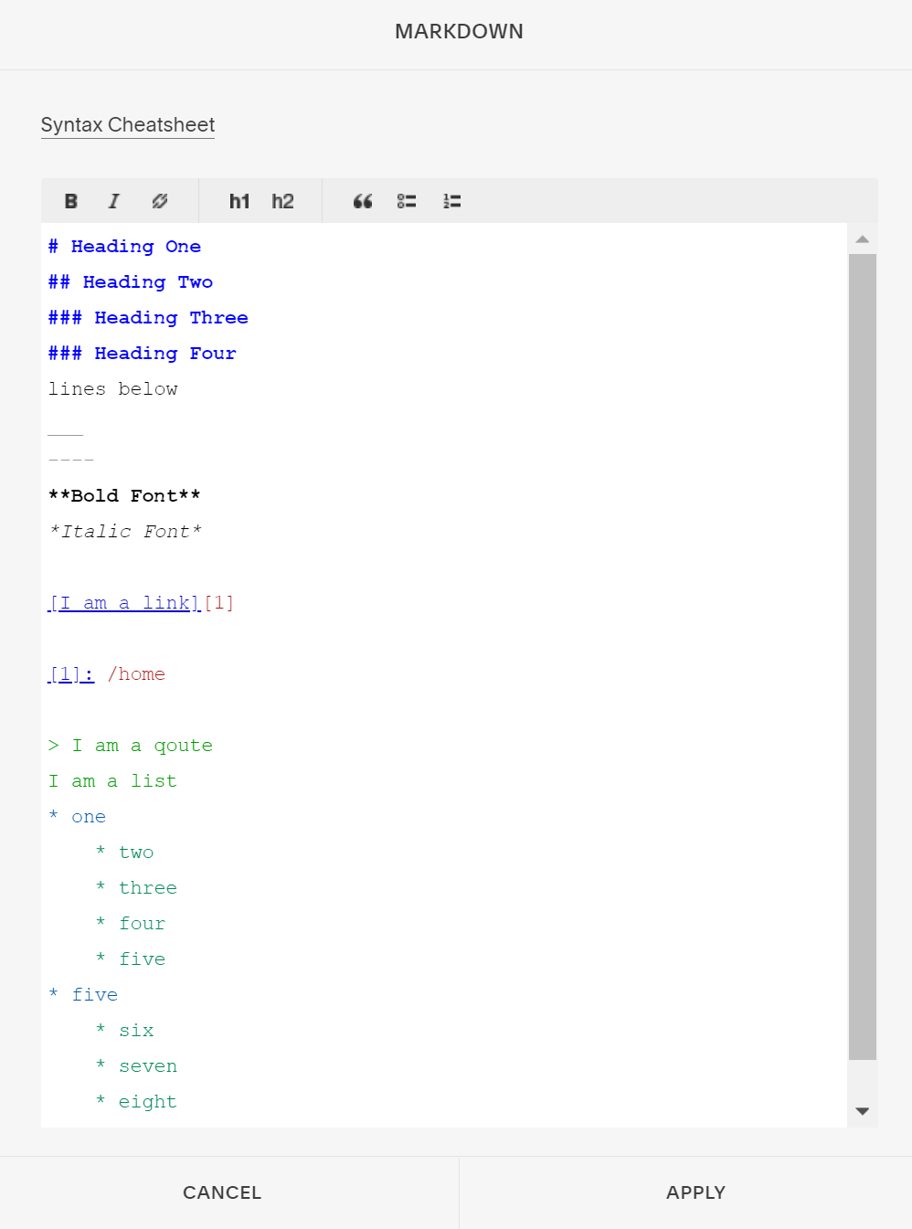
If you’re familiar with Markdown than you know how it works. if you haven’t, below is a quick overview on how to turn your plain text into rich html. Basically, markdowns distinctify the elements within the frame so that it is read properly and more easily through any web page.
It’s one of the reasons I love to use the block. But currently, it’s being underused. As mentioned before, markdowns can be used for rich html but it’s ability is further than we know or have even yet to implement in Squarespace.
Over the past years, I’ve grown to become familiar with markdown and as I learned new things I jot them down so I can share them with you. Markdown can do more than you would image. Today I am sharing 5 secrete markdown tricks you can do to make your one-of-a-kind squarespace website stand out!
Before we get started here’s a quick disclaimer: This blog is neither endorsed, sponsored, or affiliated with Squarespace. However, Please note that some links are affiliate links and I will earn a small commission if you purchase through those links. I use all the products below and recommend them because they are companies that I have found helpful and trustworthy. Please let me know if you have any questions about anything listed below.
1) Create A Horizontal Ruler/Line
If you are looking to create a more thinner and neutral line you can use markdown. It’s very simple, just apply three dashes (- - -)or underscore( _ _ _) lines in the markdown box and you’ll get a nice thin line like the one below. Above is a line block, so you can see the comparison between the two. These lines could be use in something simple but still separate certain sections or categories in your page.
2) Add Icons & Emojis
That’s right! You can add unicode icons to your website. Icons are great to use for emphasizing certain sentences, sections, or pages. You can do this by pasting the emoji or inserting the code (like this #128512;) into markdown and select the size you want in H form and your icon will change into your brand color. Notice that emojis don’t change color, but icons will. Unicode table is a great site to get emojis.
😀 🗪 🛑 🗹
3) Align Text
By default, the text starts on the left side but it’s nice to have the flexibility to align our text however we see fit, whether that’s at the right, left, or center of the page. If you’ve been wondering how you can align certain text or elements on markdown than here’s how. You can find these codes underneath the **. Feel free to copy and paste onto your markdown.
This is some text centered
This is some text to the right
** copy and paste code to markdown box **
<div align="center">Your centered text here.</div>
<div align="right">Your right text here.</div>
4) Create An Accordion/Drop down
As most of you may know, Squarespace does not offer accordion or dropdown blocks but that has not stop many of us from searching for alternatives whether it’s a code or plugin. We in someway find a way to create what we need to make our website look just how we want. However, if you’re like me and want to find a simple and easy alternative solution that can be easily understood I would recommend using markdown to create a simple accordion. Of course there are ways to improve the look but overall it’s code is easy to apply and edit. I’ve included the code below for you to use on your website. Just copy and paste and add your own title and items.
Drop down list
Click to view Section One
   Item One
   Item Two
   Item Three
   Item Four
Click to view Section Two
  Item One
  Item Two
  Item Three
Click to view Section Three
  1. Item One
  2. Item Two
** accordion code**
<details>
<summary>Insert Your Title Here </summary><p></p>
<p></p><pre>
* Item One
* Item Two
* Item Three
* Item Four
<p></p>
</pre></details>
5) Create Non Underlined Links
It’s likely you’re on a Squarespace website when you see underlined linked text (especially in the footer section) and that’s never fun being the one who has that website. But if you’re secretly like, that’s me and I wish there was a way to change that, well there is. Here’s a neat and simple trick that will steer your site from looking like a Squarespace website. All you have to do is hyperlink your prefered text in the markdown box and that’s it. No code required. So now you can go from an typical underlines link to a, “what site is this made on?”
That’s it for this post but seriously, I highly recommend you to get on your Squarespace website and play around with the markdown block. Test it out, do some research and see what all you can create in it. You’ll be shocked at all the possibilities.
I hope this blog was helpful and I hope you learned a lot today. If you’ve created some great elements using markdown, I’d love to learn what they are! Feel free to share below. 😃
Ciao!
-Berenice


