
Elizabeth Hoagland
AUGUST 2019
Brand Identity, Logo, Visual Identity, Brand Strategy, Squarespace Website, Website Redesign
Brand Overview
Elizabeth came to me with the idea of redesigning her website but she also wanted to create a strong visual identity that would fit her character, attract her audience, and align with her blog. She also wanted to promote and see her new book through her website.
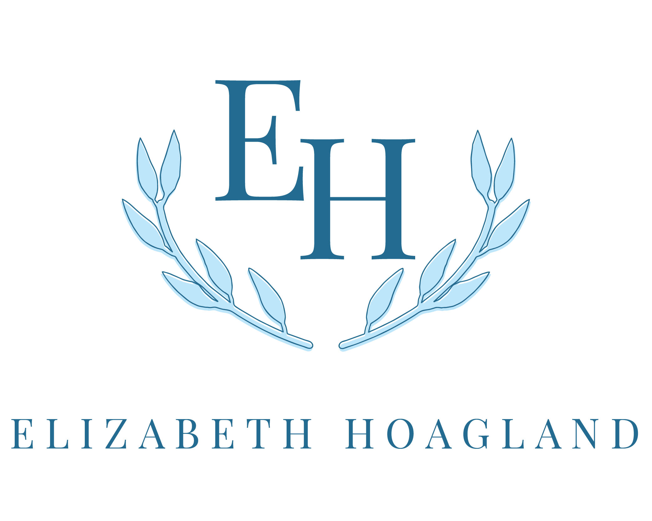
Together we worked to create a brand identity using blue tones to best represent the feel of her brand as calm, trustworthy, full of wisdom, and faith-focused. We designed a crest-type logo using leaves to symbolize growth in faith (with the most-high, God).
We also redesigned her website to better feature her blogs as well as promote her new book, Let’s Be Friends: What My Sister-Friends Taught Me About Faith, Food, and Fun. Now, Elizabeth has a website that best fits her character and that will connect with her audience.


|
Berenice took the time to thoroughly research my old website, grasping the gist of my writing and what excites me to share topics with readers. Her creativity made my new website more crisp, clean, fun, and easier to navigate which is exactly what I wanted. She also highlighted my book, “Let’s Be Friends: What My Sister-Friends Taught Me About Faith, Food, and Fun” in a concise way: how to get it, where to get it, and quotes and recipes from it to pique one’s curiosity. Thanks again, Berenice!
- Elizabeth Hoagland


